What it does
This KPI quantifies the percentage of capitalized words in an asset.
In this example, there are five capitalized words, which amounts to 33% of all words being capitalized.
Why it matters
On average people read lowercase text five to ten per cent faster than uppercase text. The outline shape of words in lowercase text are more distinctive than the outline in uppercase letters, which are uniform and rectangular in shape. This is why it’s faster to read text in lowercase letters vs. uppercase. This applies especially to longer words. In addition to word shape per se, reading habits play a critical role here. By constantly reading lowercases, we have become faster at recognising each letter in its lowercase shape.
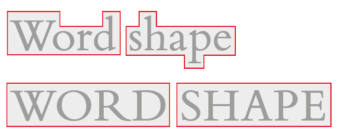
Image source: Google Fonts
How it works
A state-of-the-art text recognition (OCR) model extracts all texts from an asset. Then we compute how many of these words are capitalized (in languages where this makes sense).
How to achieve great results
Limit the use of fully capitalized words, especially in longer texts. Reserve capitalization for key words or short phrases where emphasis is required, such as headlines or call-to-action buttons. This approach maintains the visual appeal of your design while preserving easy word recognition and readability.
From left to right: the same ad headline shown in (1) all lowercase, (2) mixed case with selective emphasis, and (3) all uppercase.
AI models used
The process uses a world-class OCR model to extract texts from assets, capable of recognizing a wide range of fonts and styles in diverse visual environments.
See also: