What it does
This KPI assesses the visual simplicity of an image by evaluating its clutter and the ease with which new elements can be added without getting lost. It reflects the balance between simplicity and complexity, akin to the challenge of spotting new elements in a "Where’s Waldo?" image.
Why it matters
Simplicity in design facilitates quick and effortless information processing. Simple images enhance recall, recognition, and mental availability, as they are easier to store in memory. They provide clear entry points and focus, making the distinction between the main subject and background apparent, which is essential for effective communication and viewer engagement.
How it works
Image simplicity is measured using feature congestion (analyzing color, contrast, and orientation clutter) and subband entropy (assessing the disorder in the image). The algorithm evaluates the difficulty of introducing noticeable new elements and the entropy between different image parts. The combined score of these metrics indicates simplicity, with higher scores representing simpler images.
How to achive great results
The illustration shows sample images with model predictions. Top left image has lowest, bottom right image has highest image simplicity.
Images with high simplicity scores typically feature minimal elements, clear focus, and clean designs with ample space, such as the isolated objects (like a teapot or LEGO piece) on a plain background. In contrast, low simplicity scores are associated with cluttered compositions, multiple text blocks, or busy visuals with numerous elements that compete for attention.
AI models used
Advanced visual complexity algorithms calculate feature congestion and subband entropy. These algorithms, benchmarked on diverse visual data, effectively measure the visual simplicity of images, aiding in the design of more impactful and memorable marketing assets.
Science Background
People have an intuitive grasp of the level of complexity in an image. In science, image complexity (IC) is defined as the intricacy contained within an image (Forsythe, 2009). Objectively, IC can be considered as the amount of detail and variety in an image (Feng et al., 2023). Subjectively, it is the degree of difficulty for a human audience to understand or describe an image regarding both global abstract and local details or textures (Feng et al., 2023). For example, the plain sketch and open sky in the figure below have low IC, while the texture of architecture and the crowd of people have higher IC. The overall IC of an image is impacted by the combination of such local areas with different IC levels.
Sample images of the IC9600 dataset in different categories, such as abstract, scene, architecture, etc. ‘S1’-‘S5’ denotes the distribution of complexity scores (1-5 point scale) annotated by 17 annotators. The images are ranked by the average scores (top on each image, normalized to [0, 1]). (c) Feng et al. 2023
Researchers have investigated the factors that influence the human perception of IC(Arthur, 2002; Gauvrit et al., 2014). Oliva et al. (2014) characterized the representation of IC as the number of objects, openness, clutter, symmetry, organization, and variety of colors. Based on their analysis of 249 advertisements in consumer magazines that were tested with eye-tracking, Pieters & et al. (2010) identified six general principles that determined design complexity in advertisements: quantity of objects, irregularity of objects, dissimilarity of objects, detail of objects, asymmetry of object arrangement and irregularity of object arrangement.
Purchase et al. (2012) conducted an empirical study to investigate whether the IC could be quantified and if it could match participants’ views of complexity. The study shows that it is challenging to define an explicit metric that adequately captures the human perception of IC.
Impact of Image Complexity
The complexity of visual stimuli plays an important role in many cognitive phenomena, including attention, engagement, memorability, time perception and aesthetic evaluation (Shen et al., 2024).
Image aesthetic correlates negatively with complexity
Numerous studies have shown a negative correlation between image complexity and image aesthetics – humans find simpler images more aesthetically appealing.
Image complexity hurts brand attention, satisfaction and purchase intention
Numerous studies show that image complexity plays a critical role in webpage and advertisement design. Pieters et al. (2010) find that dense visual feature complexity in advertisements hurts customers’ attention and attitude towards the brand. Similarly, excessive complexity of background in live streaming is also shown to have negative impacts on individuals’ purchase intention (Tong et al., 2022). Visually simple ads perform better because they require less cognitive effort to process them (Trogu, 2013), have a better impact on consumers’ attention (Bakar et al., 2015), achieve better clickthrough rates (Azimi et al, 2012) and have a bigger impact on raising brand awareness (Pilelienė & Grigaliūnaitė, 2016).
Banner ads with a low level of visual complexity outperformed ads with a high level of visual complexity in a recent eye tracking study (Bocaj & Ahtik, 2023, see figure below). While users noticed complex ads slightly faster (by 0.84%), they fixated on them significantly less (by 9.09%) and looked at them less frequently (by 4.79%). An examination of user perception of the banners reinforced the superiority of simple ads, as they were perceived as more appealing in comparison.
In the online environment, consumers are overwhelmed by the amount of product choices available, and ads that are visually complex negatively influences consumers processing fluency (Wu et al., 2016;). Similarly, in digital out-of-home advertising, simple ads with a dominant visual work best (Look et al, 2010).
Visually simple packaging design results in higher perceived brand authenticity
Wang et al. (2023) show that in packaging design, consumers follow a “simple=authentic” heuristic. Across eight studies (N = 1941), they demonstrate a linear relationship whereby visually simple package designs lead to higher perceptions of brand authenticity compared to complex designs, a relationship driven by the “simple = authentic” lay theory. Simple package designs are a viable means for managers to enhance brand authenticity, which is desirable for most brands.
Visually simple packaging design results in higher willingness to pay
A series of experiments by Ton et al. (2023) show that increased willingness to pay for products in simple packaging is due to consumers often assuming that simple packaging signals few ingredients, which enhances perceived product purity. Simple packaging evokes a symbolic association whereby minimizing design complexity signals that the product contains few ingredients, which increases perceived product purity and willingness to pay. Simplifying packaging designs may be an efficient way to nonverbally communicate product attributes independent of text.
Impact of visual/design simplicity on willingness to pay
(c) Ton et al. (2023)
Simplicity in design has been associated with attributes that are often valued, such as elegance and modernity (Favier, Celhay, and Pantin-Sohier 2019). Work on brand communication has found that the use of minimalist designs can elicit value-expressive attitudes, as these designs offer a blank canvas upon which consumers express their own beliefs about the brands (To and Patrick 2017).
All of the above studies imply that visual simplicity should be carefully controlled in commercial activities.
Cultural differences
It is often said that Chinese websites are overly complex and busy in their design. However, since foreigners usually can’t use the sites — not being able to read Chinese — such impressions, formed purely by looking instead of using, are not a valid user experience assessment. To understand whether Chinese web design is indeed too complicated and whether Chinese users are in some way specially equipped to deal with this complexity, Usability experts from Nielsen Norman Group turned to a more appropriate usability methodology: emprical testing with the target audience.

Their Testing finds that Chinese and Western users experience the same difficulties with complex websites, but Chinese tend to complain less about complexity and prefer fairly high information density. To quote the Nielsen Norman Group:
It shows that Chinese people are people and not some kind of superhumans who violate the laws of user interface psychology and easily master designs that stump users in the rest of the world.
This said, there is a preference in China for “high information density” due to expectations established by a solid high-complexity design tradition.
Written language: Logographic-based languages can contain a lot of meaning in just a few characters. While these characters can look cluttered and confusing to the Western eye, they actually allow Japanese or Chinese to become comfortable with processing a lot of information in a short period of time/space. English or German usually require more space to provide the same information, and while Chinese may look denser, it is more efficient when it comes to space usage. This gives designers more possibilities concerning layout options. The results are interfaces that may appear chaotic or too full to a non-native speaker but different to Chinese, whose brains are trained to scan through complex content efficiently. Example: Chinese and Western Starbucks app in comparison:

(c) https://www.ergosign.de/en/insights/blog/ux-design-china
What could be the reasons for these differences?
Design history: Chinese history followed a different trajectory from Western civilization, missing out on the Second Industrial Revolution and the Bauhaus movement.
As a result, a unique design style emerged, blending Western photographic art with traditional Chinese drawing techniques. This decorative approach remains highly popular, with a strong appreciation for visual intricacies. Global companies often adapt the appearance of their products to avoid being perceived as unappealing in the Chinese market. Example of traditional Chinese design:

(c) https://www.ergosign.de/en/insights/blog/ux-design-china
When thousands of webpages are fed through a visual deep learning model and projected to a 2-D space, a relatively clear structure emerges:
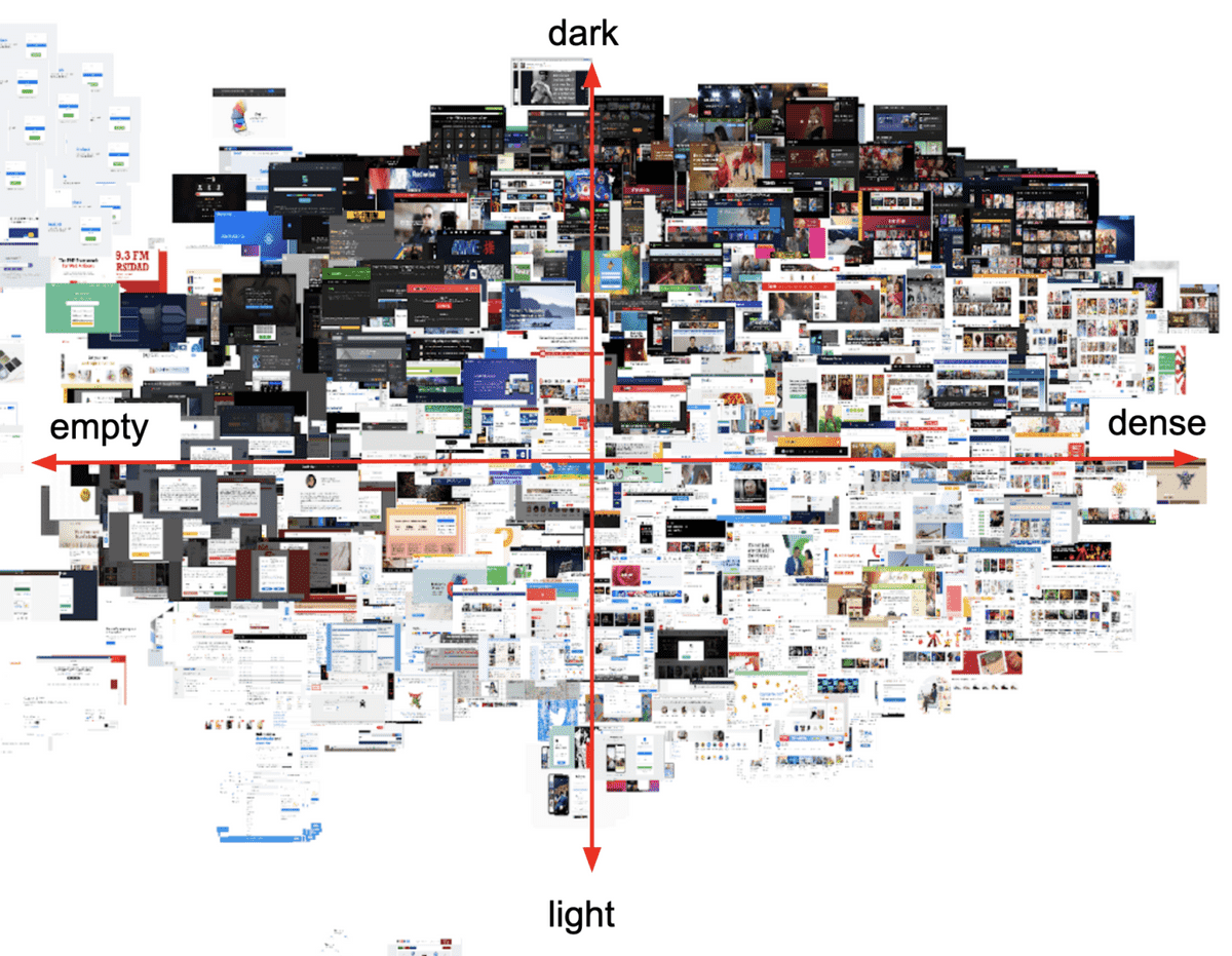
(c) https://sabrinas.space/
Below is a point graph of the above image. The red dots are Japanese websites, and you can see that most of them are in the first or fourth quadrant, or 'high-density' designs. 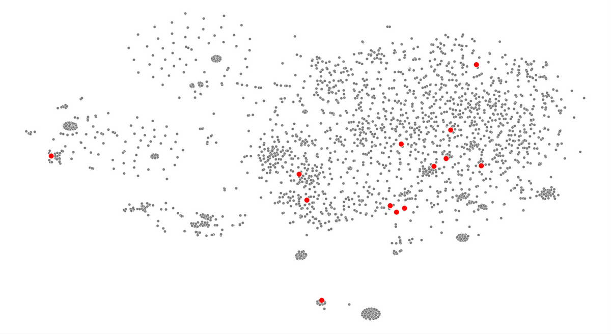
Modeling Image Simplicity
When modelling human data, such as human complexity ratings, it is important to consider the fact that human ratings themselves show variability for the same image. Kyle-Davidson et al. (2023) estimate that human visual complexity judgements correlate with r = 0.84. This sets the expected upper bound for model-human correlations, i.e. any correlation between human and model data exceeding r = 0.84 is extremely high. Another estimate of this upper limit is reported by Feng et al. (2023) for 17 vision experts that rated image complexity of 9600 images. In this case, expert ratings of visual complexity correlate with r = 0.94, higher than in the sample of Kyle-Davidson et al. of non-expert participants.
Correlations between complexity and basic image features
To assess the contribution of image features, Lagle & Navie (2020) evaluated the correlation between 38 basic visual features and perceived complexity ratings. Image features included color (e.g. colorfulness, color count), entropy, feature congestion or object count. None of the measures showed r > 0.5 when correlated individually with complexity ratings; the most informative was the object count (r = 0.49, i.e. the more objects in an image, the higher its complexity).
Lagle & Navie (2020) also tested the usefulness of the feature combination approach by using these 38 features to train three models: a linear regression, a support vector machine, and a 3-layer feed-forward neural network. Straightforward linear regressions, evaluated on an unseen, randomly selected 10% validation set, achieved on average r = 0.65. They also conducted a full leave-one-out cross-validation, obtaining r = 0.70 over 4000 iterations. The observed accuracy gain of 5 percentage points shows that a larger training set led to more accurate predictions. These results show convincingly that it is possible to predict real-world scene complexity from basic and mid-level image features at r ~0.70. While this is a promising result, the question arises whether accuracy can be further increased by also including higher-level and thus more semantic image aspects. Indeed, Kyle-Davidson et al. (2023) find that both global image properties and semantic features are important for complexity perception. They further verified this by combining identified perceptual features with the output of a neural network predictor capable of extracting semantics and found that they could increase the amount of explained human variance in complexity beyond that of low-level measures alone.
Deep learning approaches
Lagle & Navie (2020) then trained a deep learning network on the above dataset. The Inception V3 network achieved the highest correlation with perceived complexity ratings, r = 0.83, thus far exceeding the prediction accuracy of basic and mid-level image features and approaching the human-human correlation of r = 0.84. The power of deep learning in modelling perceived image complexity is further confirmed by Feng et al. (2023) who train a deep learning network on their IC9600 dataset and obtain r = 0.95, again significantly higher than simpler approaches leveraging basic image features, and exceeding human-human correlations (r = 0.94). Guo et al. (2023) also train a deep learning network on the IC9600 dataset, leveraging deep ordinal regression techniques. Their model firstly extracts global semantic information and local detail information, and then considers ordinal relationship between complexity scores in the prediction process. This model also achieves r = 0.95 against human ground truth data. Thus, it can be concluded that deep learning approaches are the currently best framework for predicting image complexity. This is confirmed by recent neuro-imaging studies showing that while model predictions based on low- or mid-level image features correlate with early visual cortex activations, human visual complexity ratings also involve higher cortical processing related to more involved perceptual (e.g. grouping) and semantic processing (Zhou et al., 2023). Indeed, Kyle-Davidson et al. (2023) find that that artificial neurons learn to extract both global image properties and semantic details from scenes for complexity prediction.
Sources:
- Almog, G. et al. (2023), Memoir study: Investigating image memorability across developmental stages. PLOS One, 18(12).
- Bainbridge WA, et al. (2013) The intrinsic memorability of face photographs. J Exp Psychol Gen 142, 1323–1334
- Bainbridge WA (2017) The memorability of people: Intrinsic memorability across transformations of a person’s face. J Exp Psychol Learn Mem Cogn 43, 706–716
- Cheng & Nielsen (2016). Are Chinese Websites Too Complex? https://www.nngroup.com/articles/china-website-complexity/
- Goetschalckx L, et al. (2018) Image memorability across longer time intervals. Memory 26, 581–588
- Goetschalckx, L. et al. (2019). Incidental image memorability, Memory, 27(9), 1273-1282.
- Hagen, T. & Espeseth, T. (2023). Image Memorability Prediction with Vision Transformers. arXiv: 2301.08647.
- Gygli M., Grabner H., Riemenschneider H. ,Nater F., and Van Gool L. (2013). The interestingness of images. In Proceedings of the IEEE International Conference on Computer Vision, pages 1633–1640, 2013
- Isola P, et al. (2011) What makes an image memorable? In IEEE Conference on Computer Vision and Pattern Recognition (CVPR), pp. 145–152
- Isola P, et al. (2014) What Makes a Photograph Memorable? IEEE Trans Pattern Anal Mach Intell 36, 1469–1482
- Jaegle, A. et al. (2019). Population response magnitude variation in inferotemporal cortex predicts image memorability. Elife 8,
- Jeong, S. K. (2023) Cross-cultural consistency of image memorability. Nature Scientific reports, 13.
- Kramer, M. A., Hebart, M. N., Baker, C. I., & Bainbridge, W. A. (2023). The features underlying the memorability of objects. Science advances, 9(17)
- Ongchoco, J. D. K., Chun, M. M., & Bainbridge, W. A. (2023). What moves us? The intrinsic memorability of dance. Journal of Experimental Psychology: Learning, Memory, and Cognition, 49(6), 889.
- Revisine, C., Goldberg, E. and Bainbridge, A. (2024). The Memorability of Voices is Predictable and Consistent across Listeners. bioRXiv
- Rust, N.C. and Mehrpour, V. (2020). Understanding Image Memorability. Trends Cogn Sci., 25(7), 557-568.
- Trent, D. and Bainbridge WA (2023) Memory for artwork is predictable, PNAS, 150 (28)
- Xie, W., Bainbridge, W. A., Inati, S. K., Baker, C. I., & Zaghloul, K. A. (2020). Memorability of words in arbitrary verbal associations modulates memory retrieval in the anterior temporal lobe. Nature Human Behaviour, 4, 937–948.